Kerny
A gamified learning app concept for graphic designers.
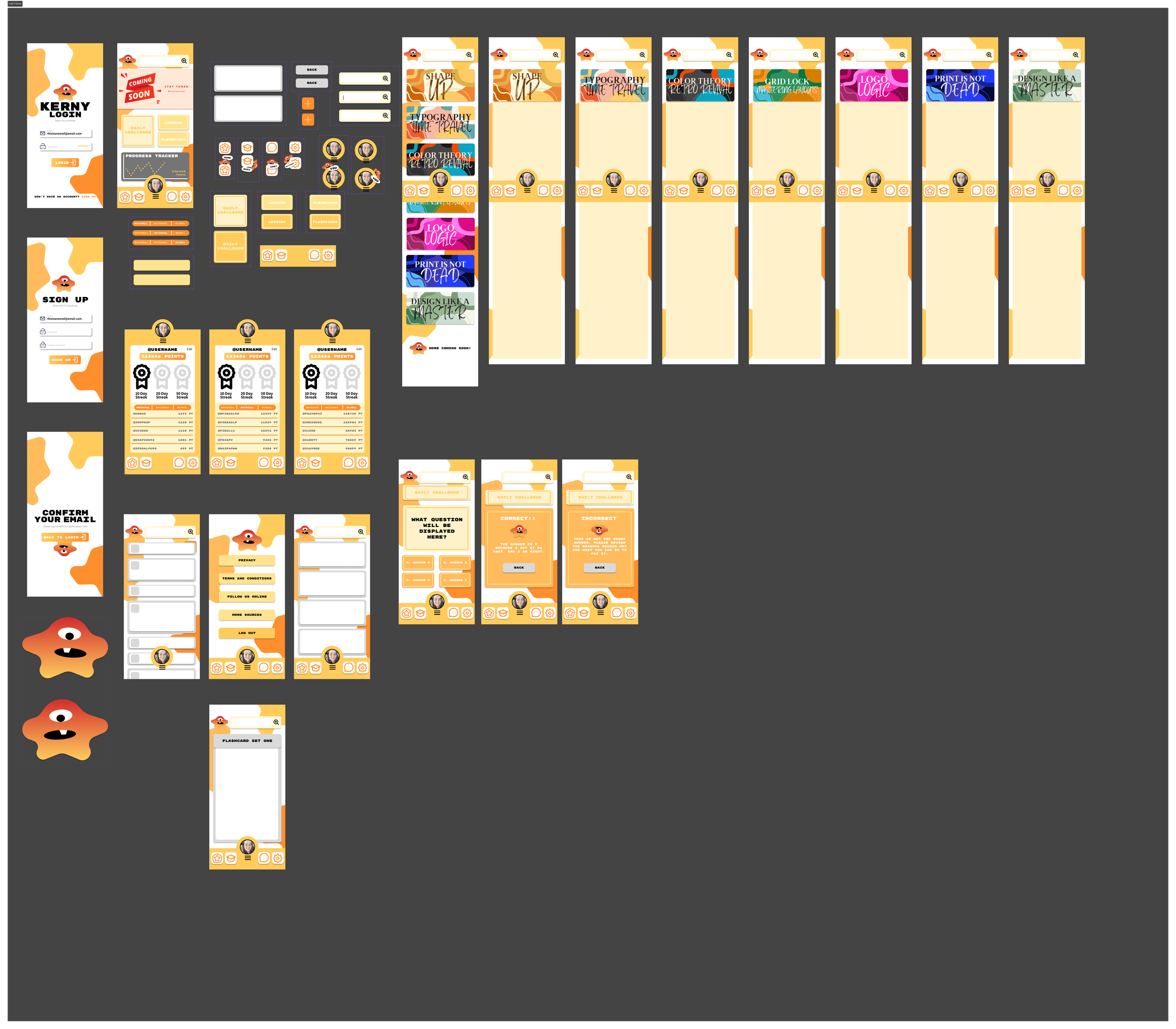
Kerny is a playful mobile UX concept inspired by language-learning apps like Duolingo. Designed for my ART 170 course, the project teaches students the fundamentals of app design, animation, navigation systems, and vector illustration through an engaging and colorful interface.
Role: UX/UI Design, Branding, Illustration
Tools: Figma
Project Type: Educational App Concept / Teaching DemoWe're a team of passionate thinkers and doers, dedicated to building with purpose and clarity. Collaboration and curiosity drive everything we do. Our process is simple, thoughtful, and designed with your experience in mind. We believe great results come from clear steps, open collaboration, and a shared sense of purpose.
Meet Kerny
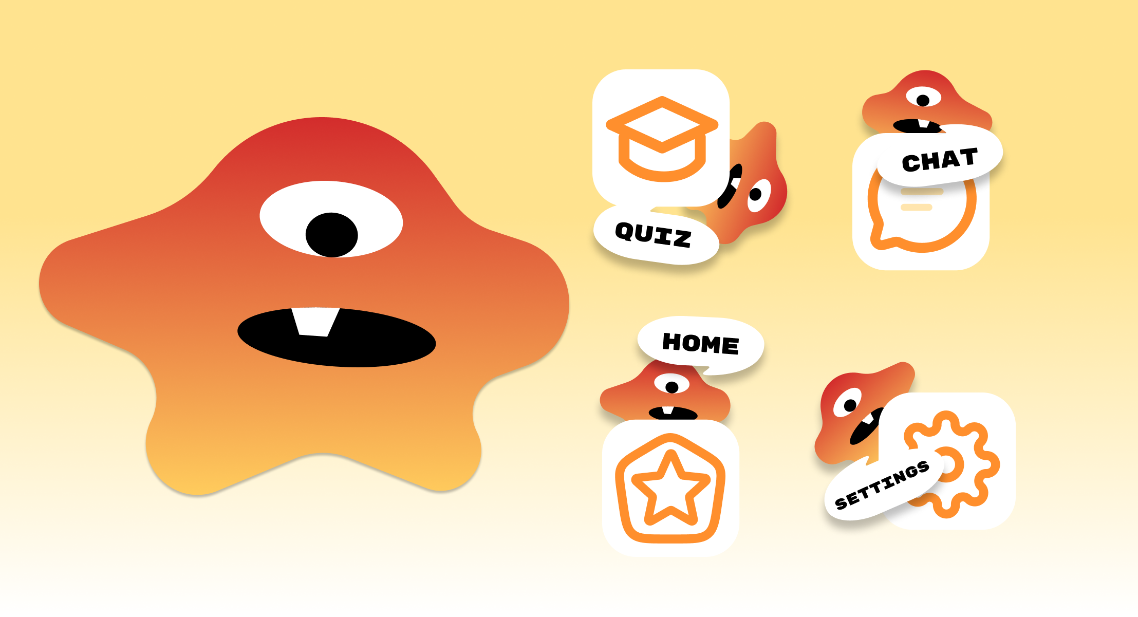
As part of the project, I created an original mascot character named Kerny to act as the visual guide throughout the app experience. The character was intentionally designed using simple vector shapes and expressive features to demonstrate how approachable illustration can still communicate personality and emotion effectively.
Beyond adding visual charm, Kerny serves an important UX purpose by helping create a more welcoming and encouraging environment for students interacting with the app. The character appears throughout lessons, rewards, and onboarding moments to reinforce progress and maintain engagement.
Creating Kerny also allowed students to explore vector illustration techniques directly inside Figma, showing how even simple visual systems can strengthen a product’s identity and usability.
The Challenge
Many students entering ART 170 have little to no experience with mobile UX design, interactive prototyping, or app-based thinking. While learning tools like Figma can feel exciting, understanding how screens connect, how interactions function, and how user flows are constructed can often feel overwhelming for beginners.
I wanted to create a project that introduced these concepts in a way that felt approachable, visually exciting, and easy to engage with. Instead of relying on static exercises alone, Kerny was developed as a fictional app concept that encouraged students to think about design systems, navigation, animation, and user interaction through a playful and familiar structure.
The goal was to create a learning experience that balanced education with creativity while helping students feel more confident experimenting with mobile UX principles.
Concept & Inspiration
Kerny was inspired by the accessibility and motivation systems commonly found in gamified learning platforms. I wanted to create an app that felt energetic, rewarding, and beginner-friendly while introducing students to foundational graphic design and UX concepts.
The name “Kerny” comes from the graphic design term kerning, which refers to the spacing between letters in typography. By transforming this technical design term into a playful mascot and brand identity, the project makes professional design language feel more approachable to newer students.
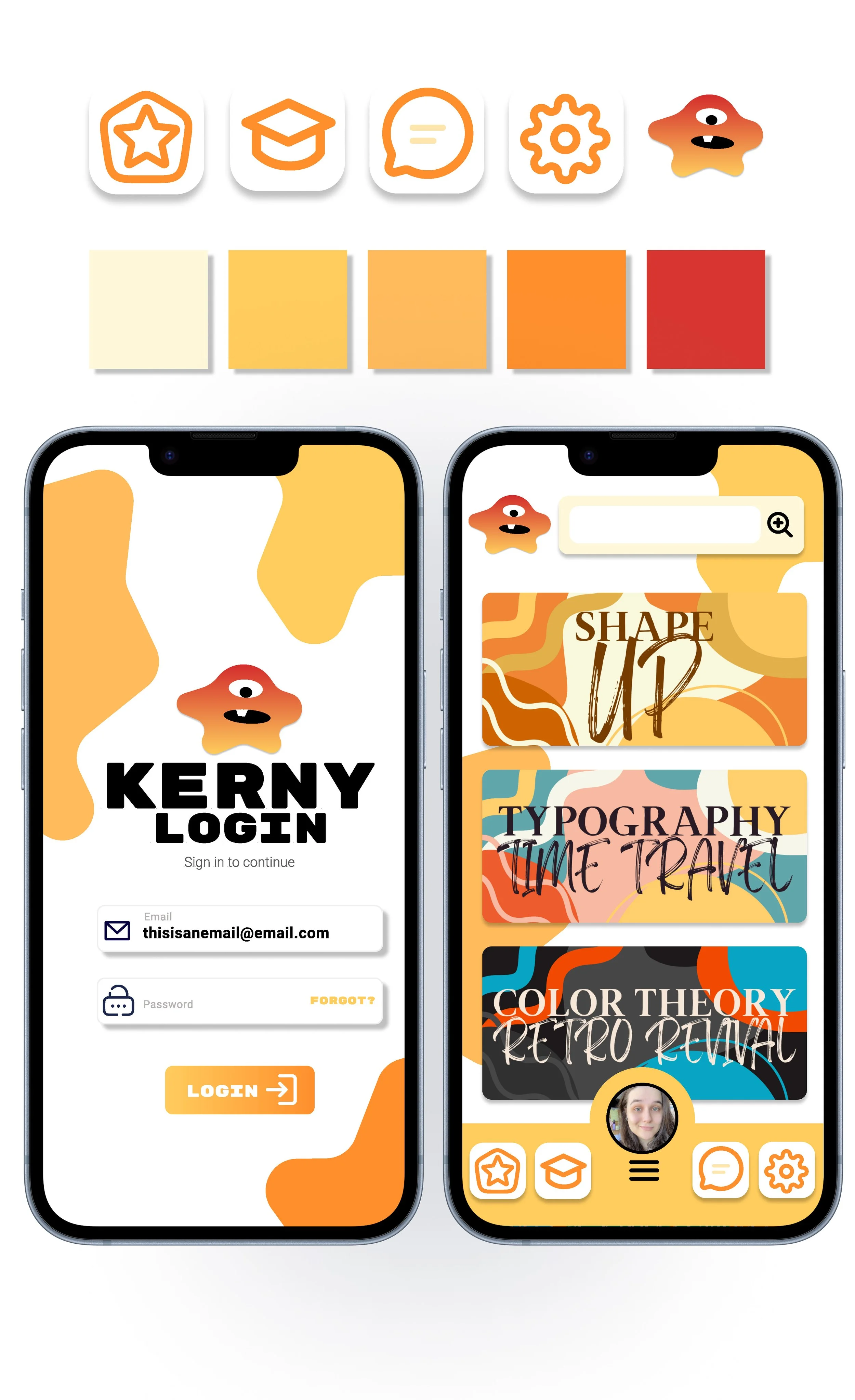
Visually, the app leans into bold color palettes, rounded shapes, expressive illustrations, and simplified layouts to create an inviting learning environment. The project also explores how strong branding and character design can strengthen emotional connection and improve user engagement.
UX & Interface Design
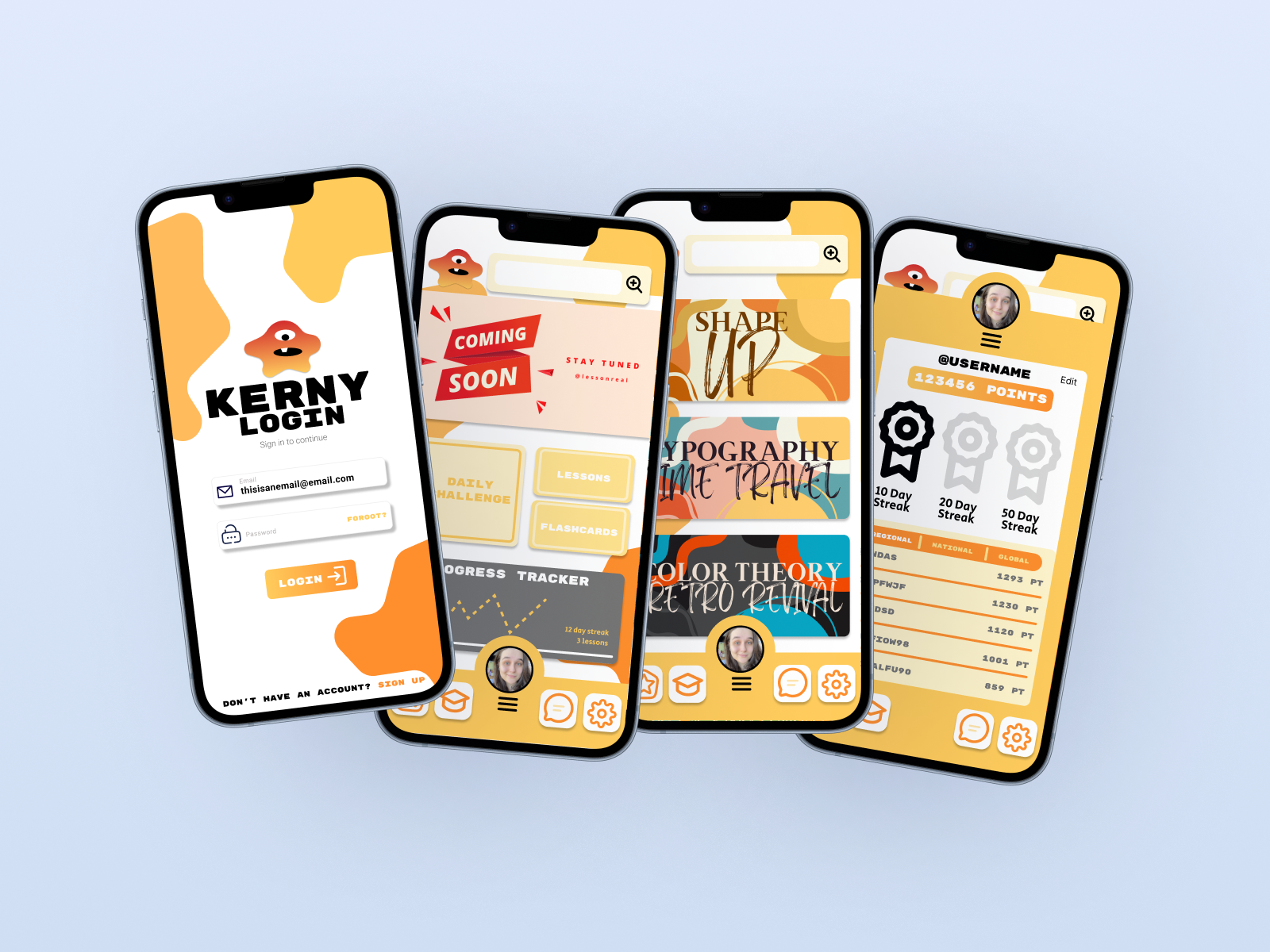
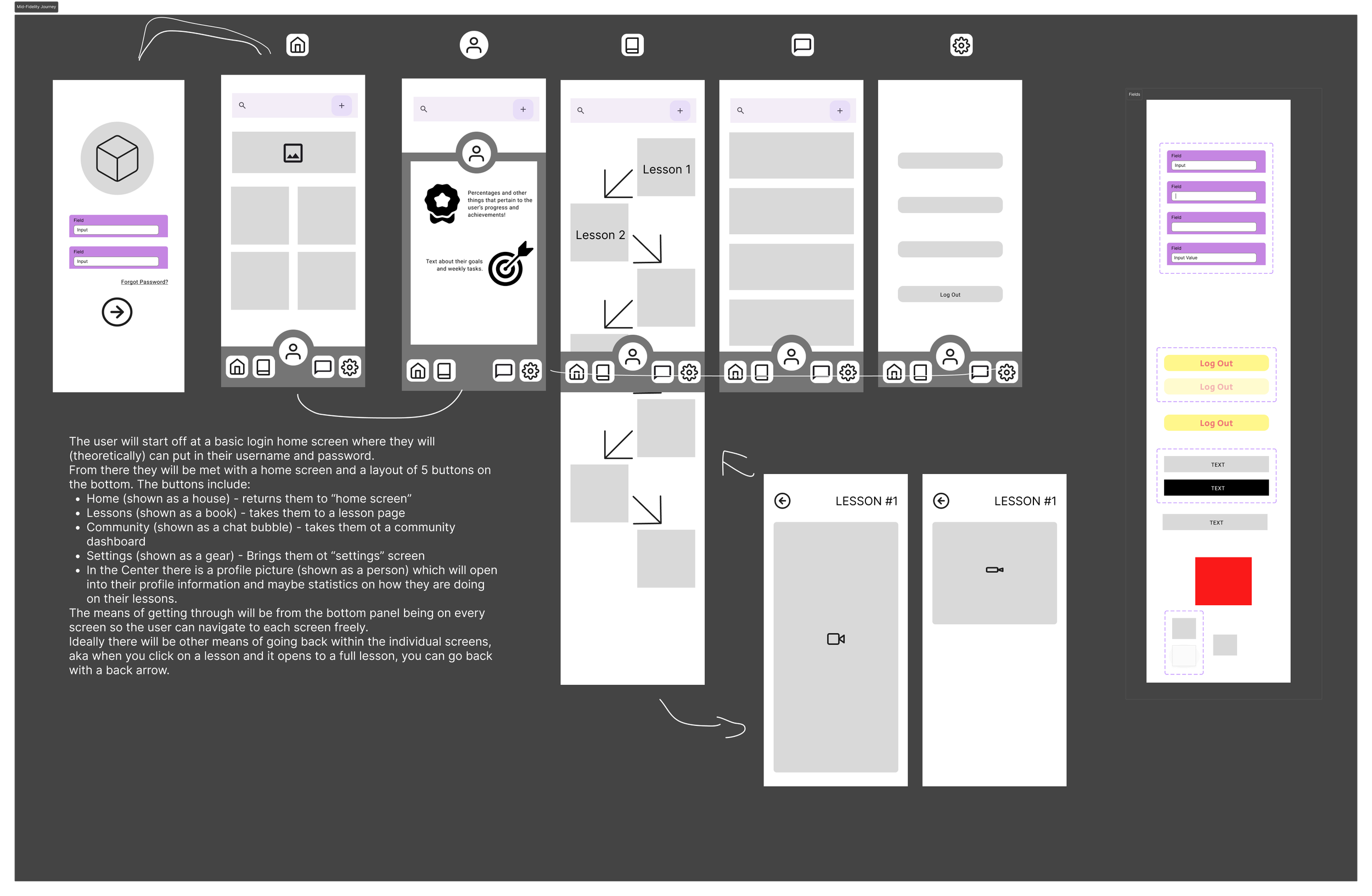
The interface design for Kerny focuses on clarity, accessibility, and rewarding interaction. Because the project was created for beginner designers, the layouts prioritize simple navigation patterns, strong visual hierarchy, and clear progression systems that make the experience easy to understand and interact with.
The app structure introduces students to common mobile UX patterns such as bottom navigation, onboarding flows, lesson progression, interactive cards, and achievement systems. Each screen was designed to reinforce consistency while maintaining the playful personality of the overall brand.
Special attention was also given to microinteractions and animation concepts within Figma. Transitions between screens, hover states, and interactive components were used to demonstrate how motion can guide users, provide feedback, and improve the overall experience.
The result is a concept that feels both educational and interactive while introducing students to real-world UX principles in a visually engaging way.
Designed as a Teaching Tool
While Kerny functions as a mobile app concept, the project was ultimately designed as an educational framework for students learning the basics of UX/UI design. The app became a hands-on example used to demonstrate how visual systems, interaction design, branding, and prototyping work together within a cohesive digital experience.
Students were encouraged to analyze the app’s structure while building their own interfaces, animations, and navigation systems inside Figma. Through this process, they gained experience with wireframing, screen hierarchy, vector illustration, design consistency, and user-centered thinking.
By combining playful visuals with foundational UX principles, Kerny helped create a learning experience that felt less intimidating and more exploratory for beginner designers.
Reflection & Takeaways
Kerny became more than just a classroom exercise. It evolved into a project that explored how personality, interaction, and education can coexist within a digital product experience.
One of the biggest takeaways from this project was learning how important emotional engagement can be within UX design. By combining gamification, character design, and simplified interactions, the app creates a more approachable environment for users who may initially feel intimidated by design software or technical concepts.
The project also reinforced the value of building strong visual systems early in the design process. Establishing consistent colors, typography, components, and interaction patterns helped maintain cohesion across the entire experience while making future expansion easier.
Ultimately, Kerny demonstrates my interest in designing experiences that are not only visually engaging, but also educational, accessible, and user-focused.